Why Your Applications Should Look "Cute"
 Since computers first entered the workforce, business applications (that is to say, all applications which weren't games) have been boring and to-the-point.
This seems to be a holdover from the stark green-on-black mainframe screens, which themselves were holdovers from printed paper forms.
Read on to see why having a "cute" UI needs to be featured in all your applications-- and not just the ones for kids or millennials.
First, Some Definitions
Let me start by explaining what I mean by "cute" applications.
I am describing UI with soft colors, playful borders, muted icons. You may also know this as "friendly" UI. Whatever you call it, it's unmistakable when you see it.
Some Examples
Let's see some side-by-side comparisons a "business" UI vs. a "cute" UI.
Here is a screen shot from IPVanish (a VPN application):
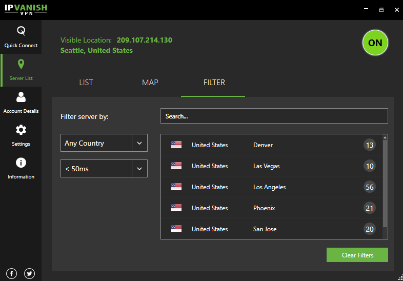
While not overly bland, its dark scheme evokes a sense of foreboding. It may make the average user feel like they are in a 90's hacker movie.
For a sharp comparison, see TunnelBear (also a VPN service):
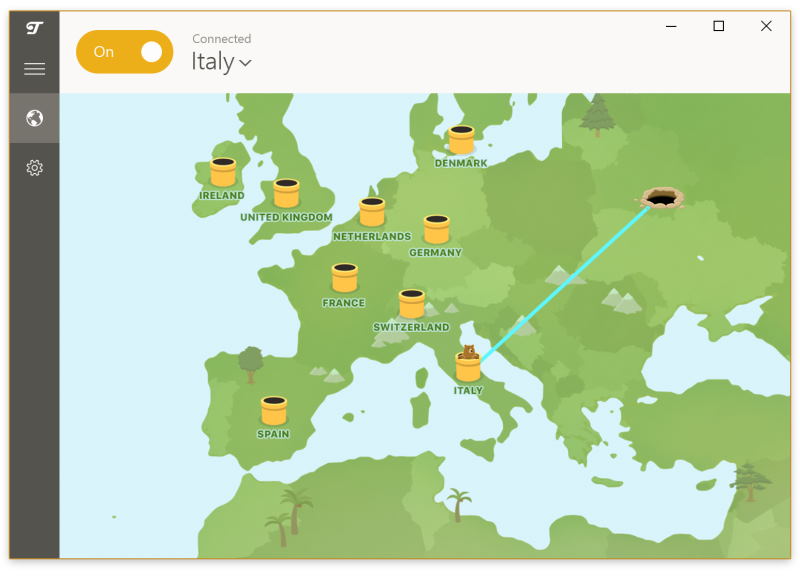
TunnelBear's entire UI is based around being "cute". Your network routing is represented as a bear digging a tunnel to other countries, and when you connect, the bear usually pops out of a Mario Bros pipe, wearing a hat from that country.
It's silly and cute, which makes it immediately feel more approachable than other options. Users don't feel like they are entering the dark web or any other hacker-haven. And perhaps most importantly, when users trust your application, they are more likely to spend money on it.
Another Example (With Shameless Self-Promotion)
For those that do not know, I own the company Liftoff Academics, which develops and hosts web-based software for Higher Education. Higher Ed software is a field rife with boring application UI, especially when the software is geared towards the faculty or staff and not students.
Let's look at these screenshots of Activity Insight, by Digital Measures. This program lets faculty enter their achievements, presentations, etc.
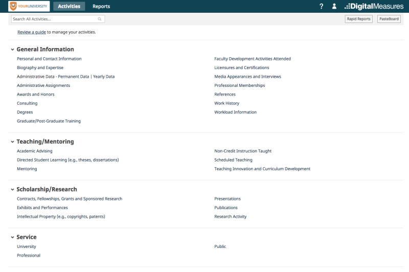
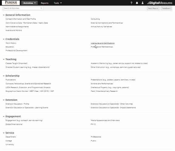
Stark, plain, and boring.
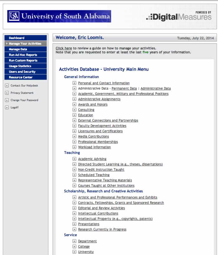
Now, look at a similar product which I created, called Faculty Atlas:
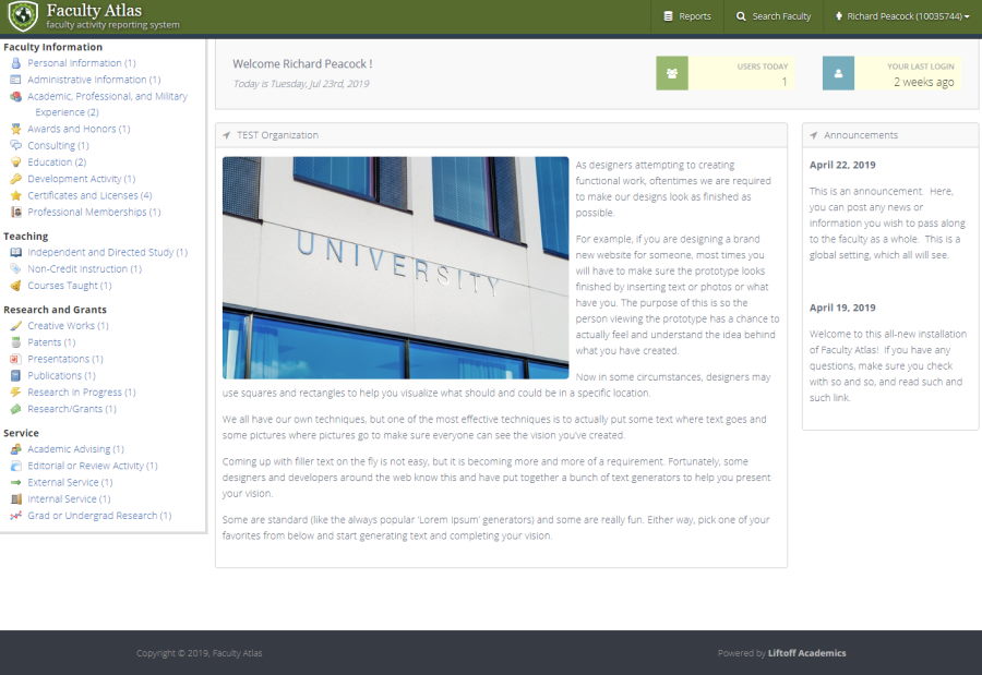
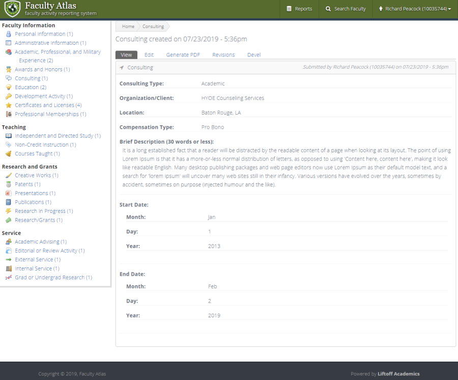
Hopefully I have (shamelessly) made my point: Faculty Atlas, while performing similar functions, has much more appeal simply by the addition of soft icons and colors. This makes it feel much less intimidating for new or novice users, especially users who might already resent having to adopt a new software application in the first place.
Where to Get Cute Icons For Free?
The quickest way to make your applications cuter is to throw in friendly icons. Give your "Submit" buttons a little check box, give each menu item their own indicator-- that sort of thing.
I am a huge fan of the Silk Icon Set by famfamfam, and it is used heavily in Faculty Atlas. These are tiny .png image files. The only restriction is the designer asks that you give him credit on a Help page or About page, that sort of thing.
Another very popular option these days is making use of the Font Awesome icon-based font. This is an actual font you bring in to your web application, and then certain characters display as icons, rather than letters and numbers. You can make icons appear easily by adding in CSS classes to elements.